
Vela App
UX Design/UI Design
Competitive analysis
User Interviews
Concept Development
Wireframing
Prototyping
User Testing
Photoshop, Sketch, Invision, Optimal Sort, Usability Hub, After Effects
Careefoundry: Valeria Zaide,
Frederico Valensise
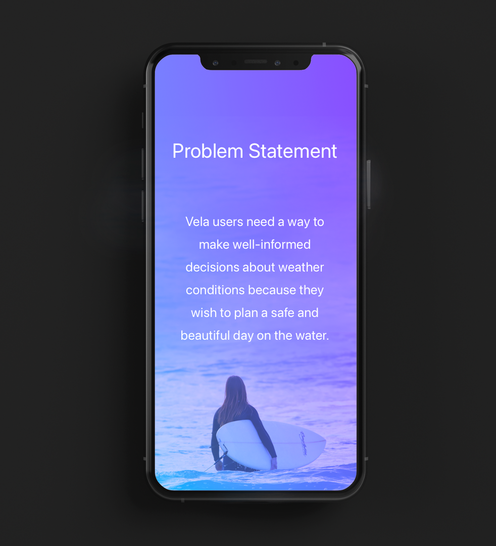
To design an experience that allows a user to gather weather information and additional facts regarding their water activity.
An app that captures the beauty and fun of a day at the water in the user experience of this app.


To develop the Vela App, I went through the stages of the design thinking process.
Research Goals
- To better understand user behavior around the activity of water sports.
- To find out which tasks users would like to complete using this water weather app.
- Documenting user pain points with existing water sports weather apps.
- Collecting data on the context in which users would use a water weather app.

Competitor analysis
By analyzing potential competitors, I got a better impression of what other services are out there and what experience they are offering. My analysis included:
key objectives
overall strategy
market advantage
marketing profile
strengths
weaknesses
opportunities
threats
usability
layout
navigation structure
compatibility
differentiation
CTA (Calls to Action)
I surveyed potential users and combined it with interviews with sailors and surfers to collect quantitative and qualitative data.
I wanted to discover the data that helped me develop a new and helpful experience.
Research Goals
- I wanted to identify my target audience and understand their behavior.
- Find out their main pain points while being out at the water or using other apps.
- Deciding on the essential features to provide a unique user experience.

With Empathy Maps and Affinity Mapping, I analyzed the data for findings, insights, and possible solutions. Finally, I developed User Personas and User Journeys to have a basis for informed decisions during the process.


I conducted a card sort to test and refine the app’s information architecture.
Card Sort Data
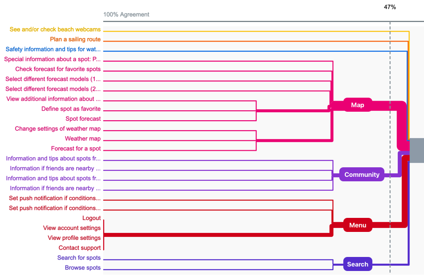

Key Findings
The vela app is task-focused, so data conclusions were limited. The participants seemed to sort the cards more in terms of similarity in meaning than usability. For example, the card "set push notification: good conditions "was sorted mainly with "account settings "and "profile settings." All settings together can make sense, but in this case, it might not be helpful if you probably will take this decision when you're in the spot forecast section.
I transferred the information architecture first to low-fidelity sketches and then to a mid-fidelity prototype.
I started wireframing in Sketch and designed a click-dummy in Invision. I followed the iOS Human Interface Guidelines, a grid system, and a mobile-first approach.


I conducted a usability test to evaluate the UX of the prototype. I asked the testers to follow specific tasks to see how they were doing. I encouraged them to describe what they saw and felt during the test. I created an affinity map to sort out my findings and to discover the main points by rating their severity.
A preference test helped me to refine design decisions. Although I tested onboarding screens, the results concerning typography influenced the whole design.
key objectives
overall strategy
market advantage
marketing profile
strengths
weaknesses
opportunities
threats
usability
layout
navigation structure
compatibility
differentiation
CTA (Calls to Action)

The design of the Vela App is documented in a design system that ensures a consistent appearance throughout the app. The design system is indispensable to evolving the app organically.
Logo
The Logo of the Vela is built with the apple font SF Pro Display Ultralight italic.
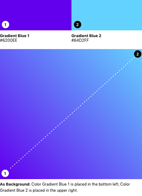
The Vela Gradient in the background is a metaphor for the sunlight shining through deep waters and the changing blues of a wide sky. The loading animation consists of windlike moving white circles around the logo.
Colors
Vela Gradient
Colors

„On“ Color/Typography Colors

Typography

Iconography

Imagery
The imagery of the Vela App shows watersport fun and activity. The image’s composition is reduced, with large parts of plain areas to place the copy.
The gradient is in the background; the bitmap picture also contains the gradient with 50% opacity.

After testing, iterating, and polishing, the Vela App is in a final state. But still, since an app is living and breathing, many iterations will follow.
Thank you for your interest!


